Ember
A user experience case study
Ember’s bringing last-mile where it's critical, and when no one else is. I believe Ember deeply cares about the people's experience. We have that in common.
This project was a way for me to live my dream: if I could work at Ember (for two days), what would I do?
CASE STUDY EMBER
TOOLS FIGMA, FIGMA MAKE, FUSION 360, CODEX, COFFEE
TIMEFRAME 48 HOURS, 11/05/26 - 12/05/26
ROLE AN ember enthusiast
In appreciation of Ember:
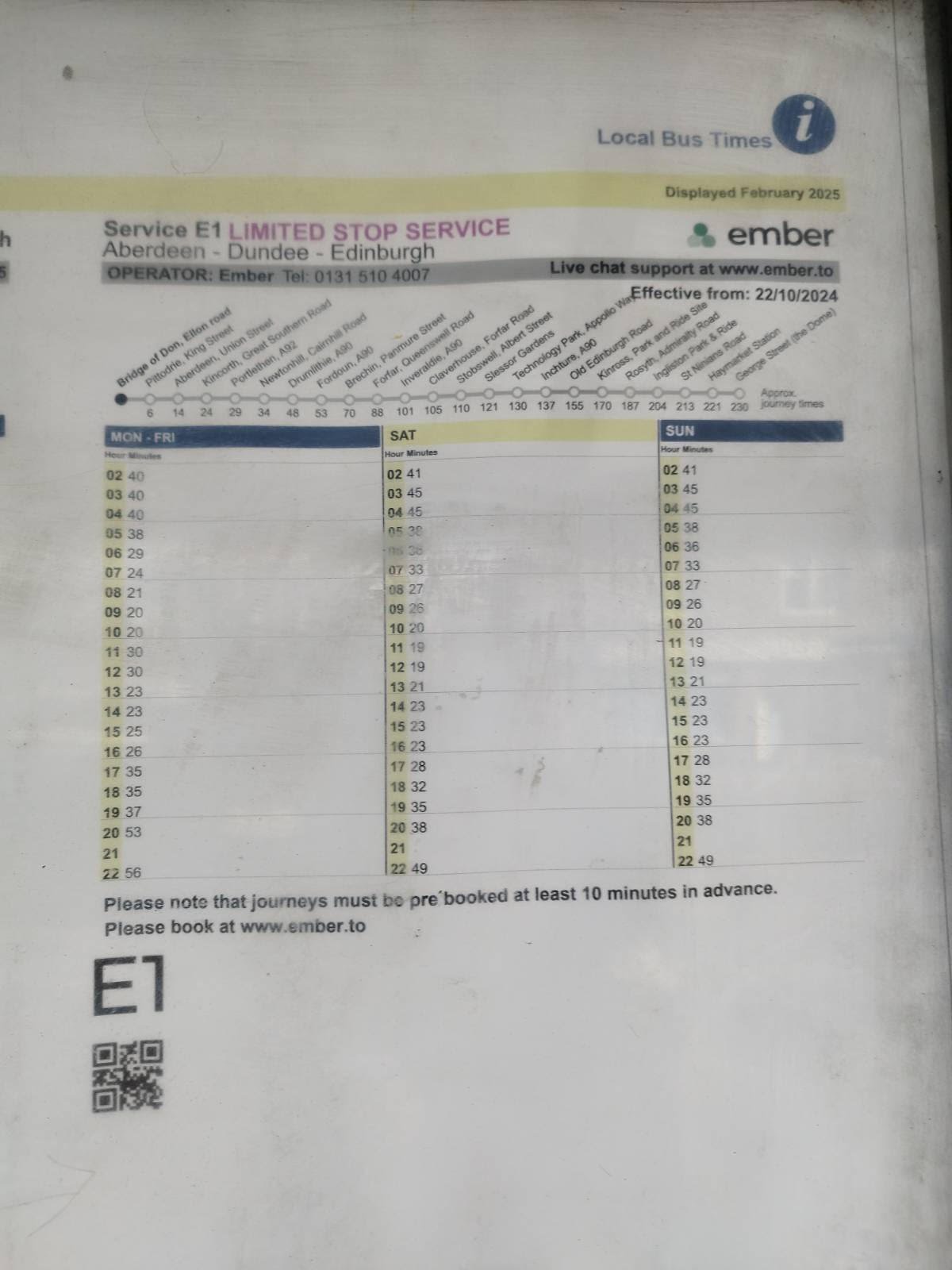
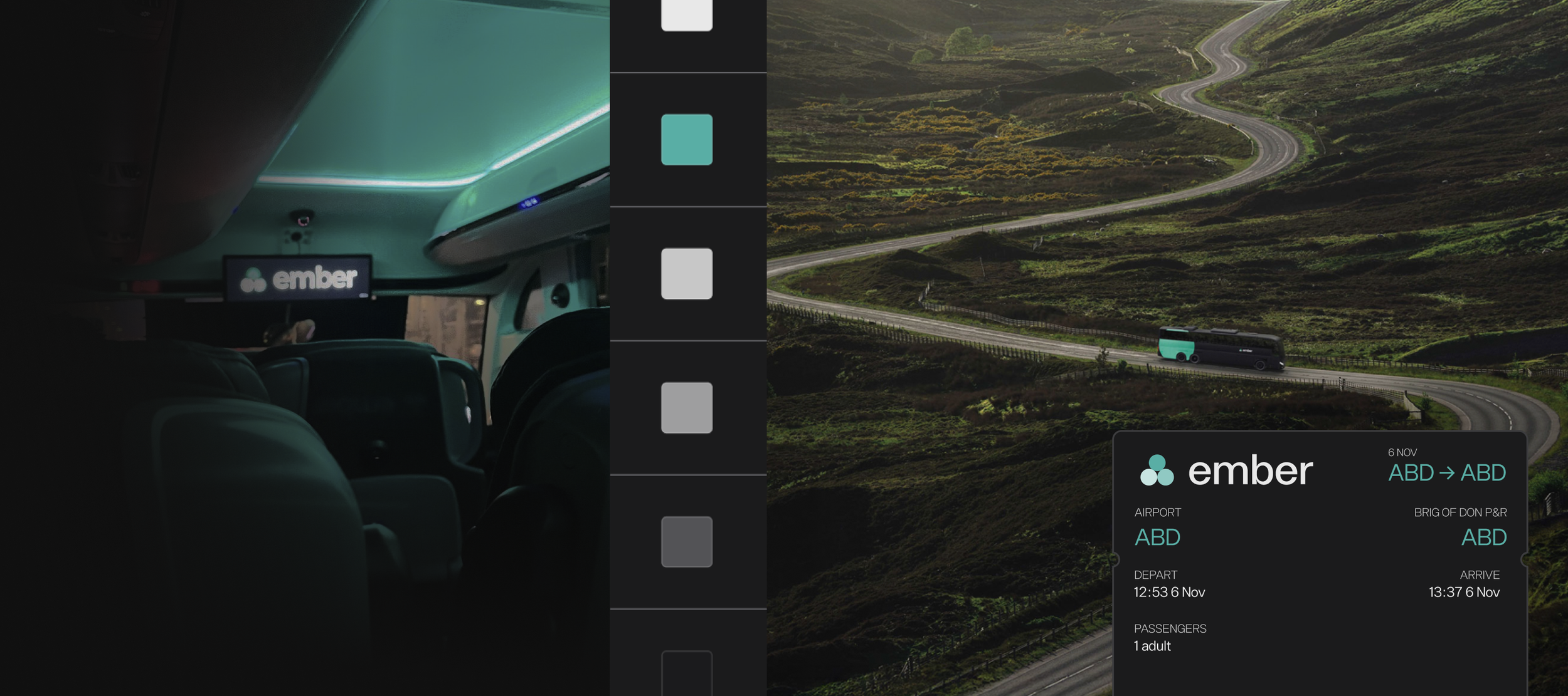
My partner and I used to live separately in Aberdeen, and travelled to Edinburgh often. This involved coordinating when to leave, booking coaches (we knew we won't have a fun time on), and walking down to the bus station which took 50 minutes.
Last year, we moved in together, and found out about Ember at a nearby bus stop.
This is the photo my partner zealously sent me.
And traveling to Edinburgh has been a joy since. Meeting family and friends is about just that now.
I have also gotten off a plane, managed to book an Ember while still waiting for my luggage, and gotten onboard as soon as I stepped out the airport. Smoothest and cheapest way to come home ever!
I share this in genuine awe of the difference you’re making to people’s lives.
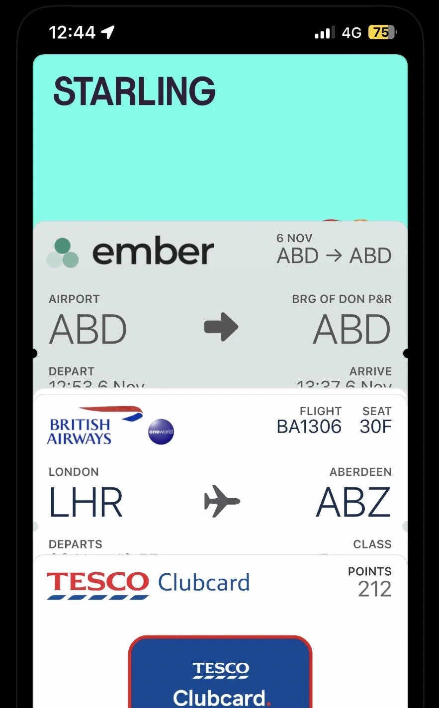
12:20: flight lands, 12:30 mobile data starts working, 12:35: I see and book an Ember. 12:44, I’m out seeing the Ember turn towards the Airport - for me!
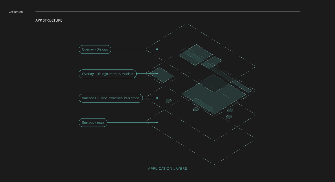
The story of Ember revolves around the traveller. I started with mapping out all the touchpoints that have a bearing on the user’s experience - physical and digital. It provided a lay of the land with clearer directions for strategizing what to research further and how to pull together ideas on the way.
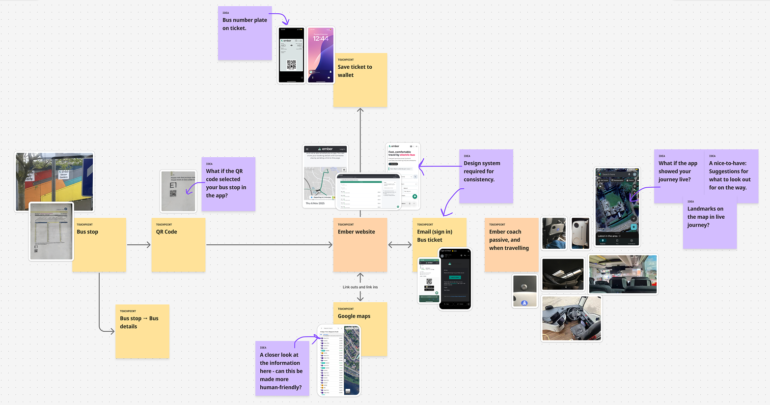
Next, I focused on a design audit across the Ember’s digital touchpoints, including the website and email, the ember pass, and presence on Google Maps. I evaluated each surface through a product lens first: identifying usability pain points, experience gaps, and opportunities to improve clarity, and overall user comfort. The goal was to uncover where the experience could feel more intuitive (Simple), cohesive (Transparent), and supportive.
Audit outcomes
I identified critical inconsistencies across the interface and outlined requirements for a comprehensive design system to improve user experience and brand consistency. Have a look!
Identified challenges
Components lack standardized interaction states, variants, and usage guidance.
Color usage is inconsistent, with brand tokens overextended and weakening semantic meaning.
UX copy varies across the product and service without clear principles or patterns.
A need for a Design system
A scalable design system is required with defined color tokens, component standards, and usage guidelines.
Consistent interaction states and variants across all core UI elements.
Clear UX copy principles to support consistency, clarity, and brand alignment.
Reflections, potential impact:
Having a watertight design system would help scale Ember’s brand beyond the web app across all customer touchpoints, consistently.
It would improve user understanding and confidence (in way finding on ember.to, and across other touchpoints). Stronger user mental models equal higher conversion.
Opportunity for a ‘premium’ experience - brand presence (as Ember scales itself) and a more cohesive experience throughout.
The audit helped steer further effort towards building a design system. But a deeper brainstorming session was required to identify the key improvement areas and challenges that it could address. Consistency isn’t always a good excuse for a design system (given the effort). It needed purpose - in what the brand is, and wants to be.
The session helped reflect on additional layers of ideas and improvement areas - and how they align with Ember’s current brand values (Simple, Affordable, Transparent). Some ideas push these values further, while others start to aggregate and warrant newer complimentary values such as ‘Memorable’.
Both, ideating design (like user flows, technology integration, interface) and building a brand identity borrow heavily from this stage. Brainstorming sessions are generally a key point (at work) for me to gather signals from business logic and a gut-check from tech on if some are ideas are worth pursuing/pushing/parking.
For now, it helped me scope my effort towards building a design system reflective of the brand’s values, current challenges, and most importantly, scalable value choices - that can be extrapolated from (as complexity grows), modified (such as brand tokens) and project the brand identity forward into the future.
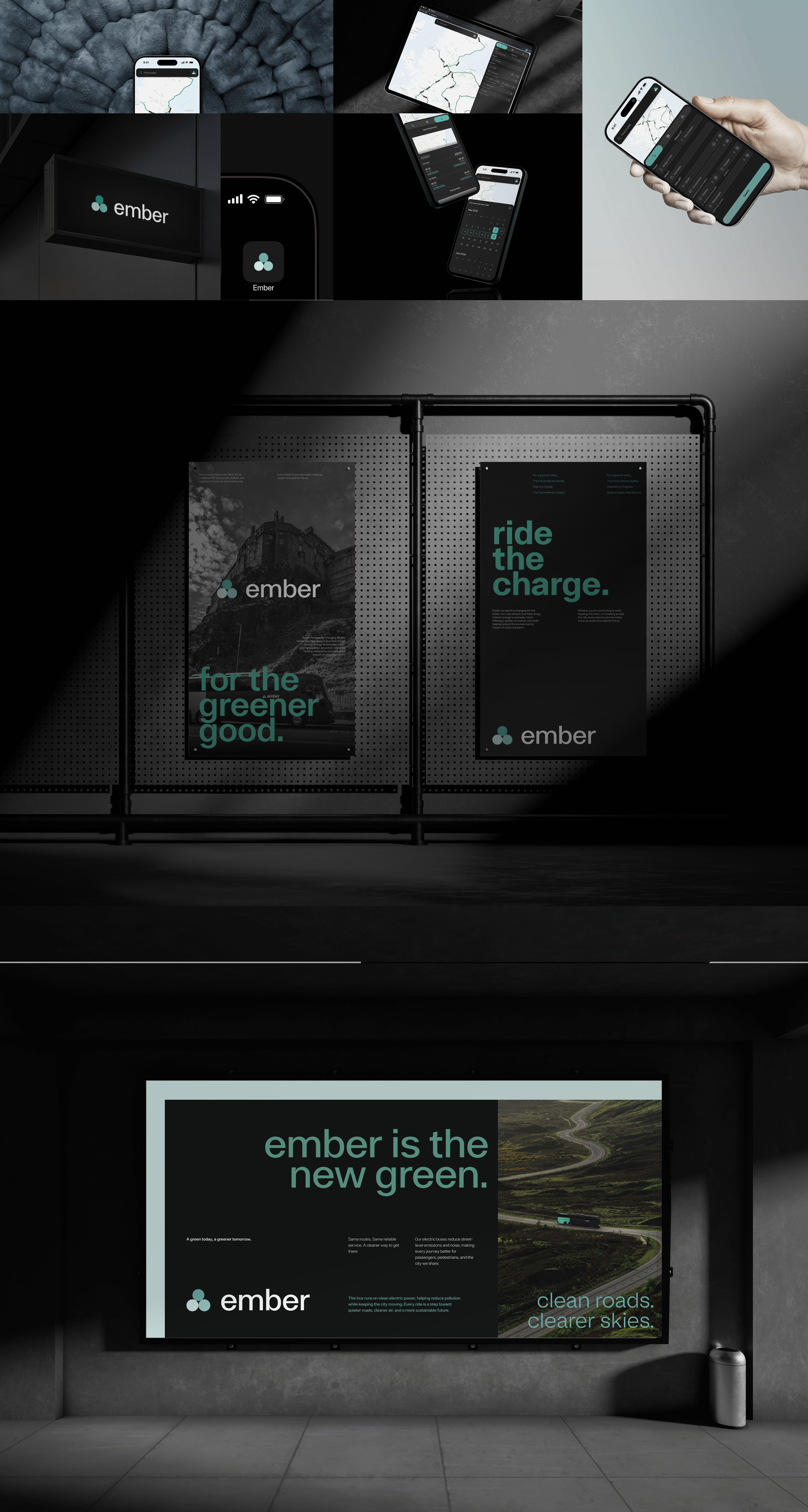
time to go old school .\,,/
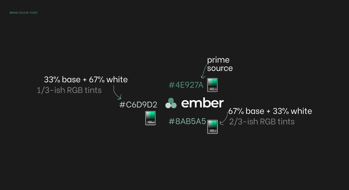
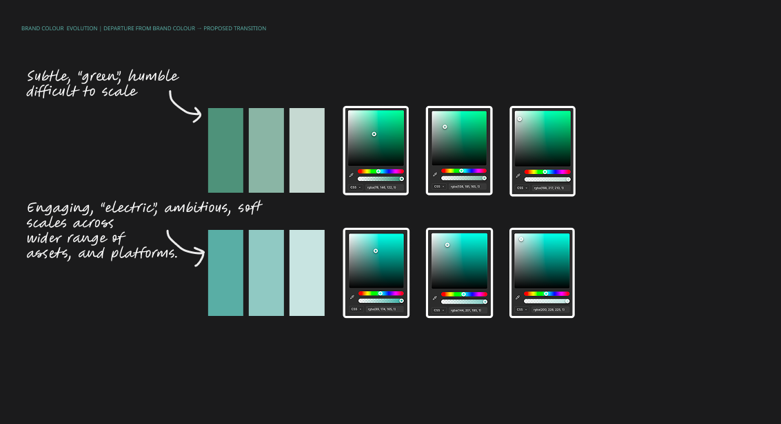
The design-system explorations began with colour. A primary challenge identified was that the brand colour is stretched thin. I built a hierarchy downwards from the primary colour to reserve it for more exclusive use.
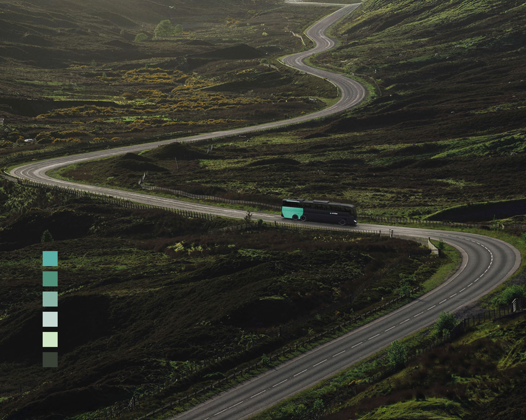
Once the primary, secondary and tertiary colours were anchored, I auto-generated variants from this controlled set. Automating at this stage was viable, but not without scrutiny of the variants, before they made the cut. Once the colour set was ready, I used Figma Make to batch-generate components - for a fast feedback loop and observe usage of brand colours en-masse.
The brand colour did not scale well against neutrals. Visually, it felt dull and required a rethink to be scalable across the UI, and especially beyond. So I pursued a change in direction - overhauling the brand colour.
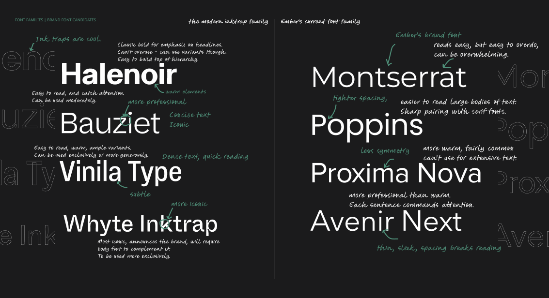
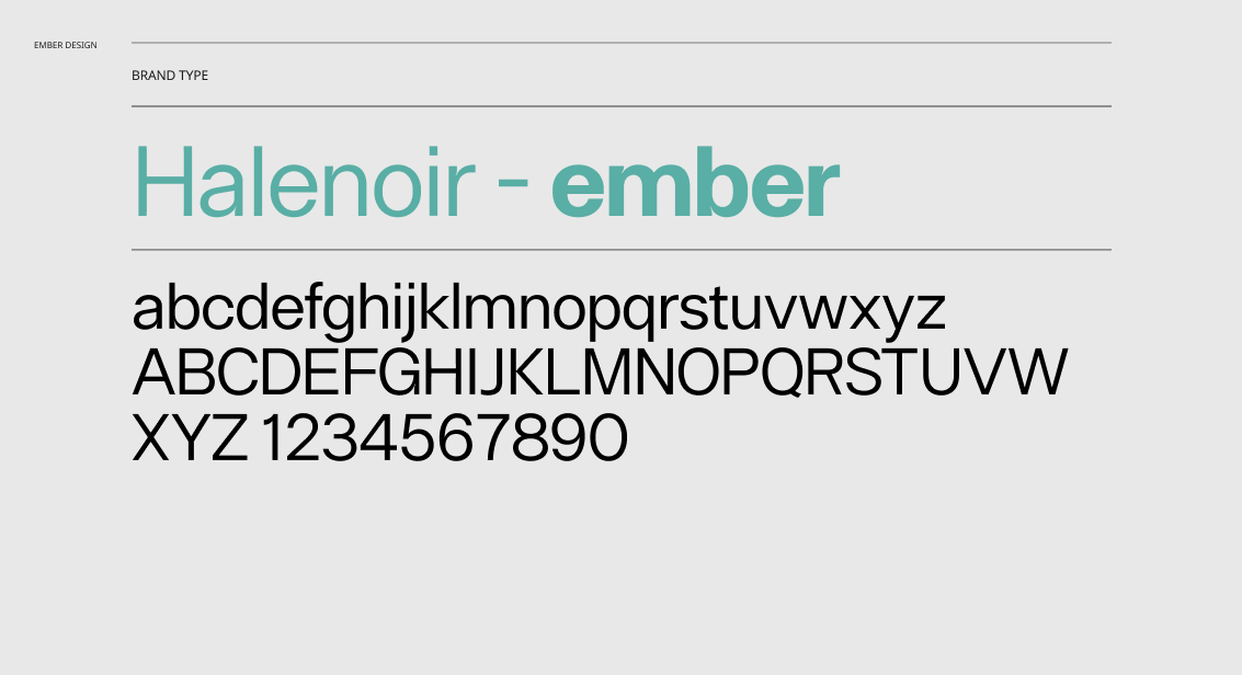
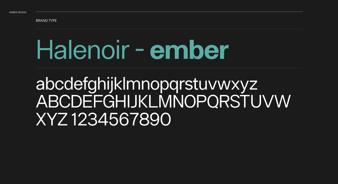
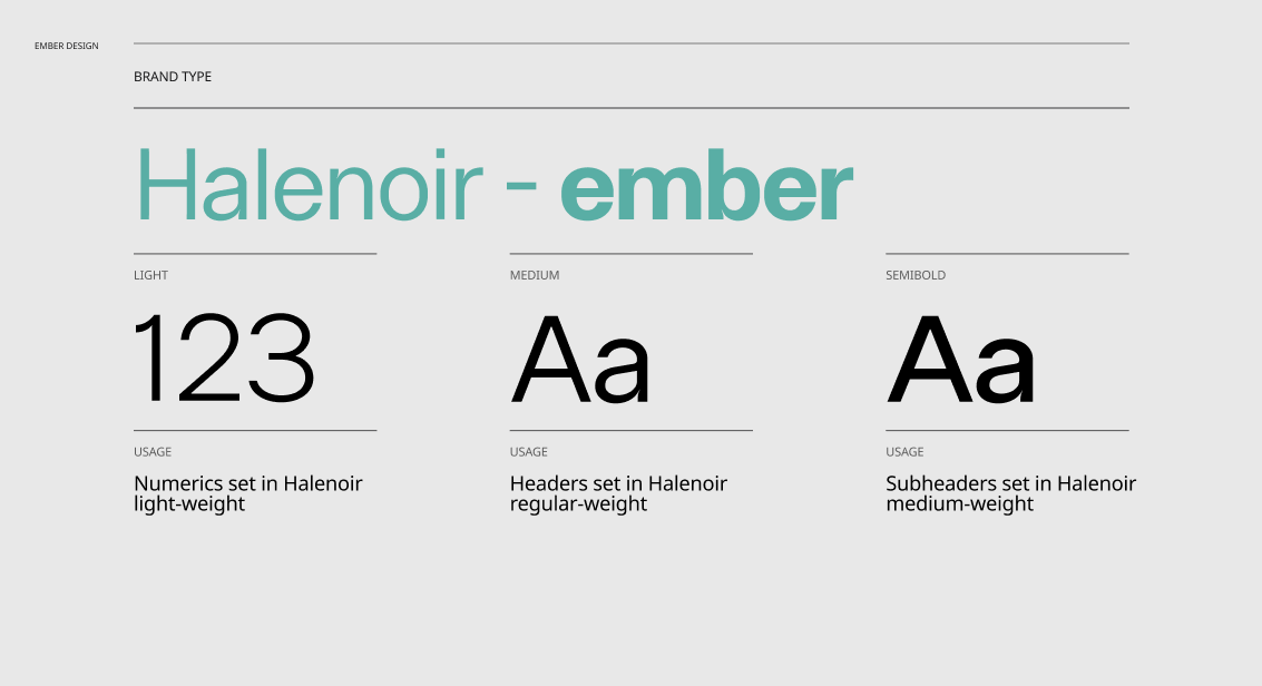
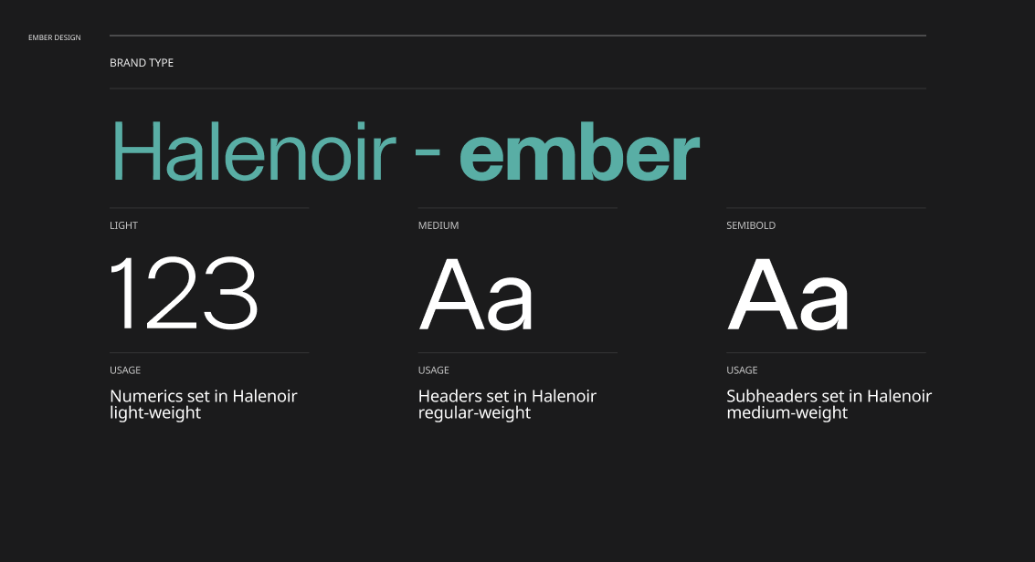
Ember’s current brand font is Montserrat - which has a strong circular logic with round counters. This ties the logo and word mark well. But the continuity is too literal and not proportional.
And it comes at the cost of a relatively wide tracking - which makes it suitable for bold headings, but not body type. Despite this, the entire Ember website today uses Montserrat only. This makes the content quite chunky, difficult to read, and dilutes the brand.
I wanted to explore a richer, deeper connection between the logo and word mark. I looked at font families with ink traps that complement the circular interstices in the logo subtly, and amply.
Another two strong considerations were brand presence and scalability. For this, I picked licensed fonts that offered an extensive purpose-built choice to scale identity across editorial, UI, signage, decks, and campaigns.


With the building blocks of the brand coming together, it was time to ideate how Ember can meet the user where they are. This required thinking about gaps and opportunities in user’s experience outside the purview of brand presence.
Whacky idea (Logistics notwithstanding): What if the QR code at the bus stop points user to ember.to, having queried the user’s bus stop for them? To curate routes and coaches based on where they are!
Worth validating:
Would it lead to higher conversion?
Would users engage with the website more if it was contextualised?
I dislike poor phone handling with a passion. So I tried redesigning the tray profile.
Whacky idea:
Cables are easy to forget. And messy.
What if we never needed to carry them?
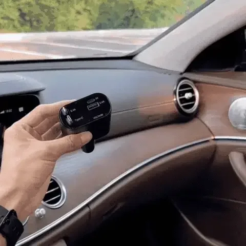
Phones. shouldn't. drop.
A lot of media today is consumed in portrait form. Yet no coaches accommodate this. This leads to poor travel experience. Here’s my partner’s phone:
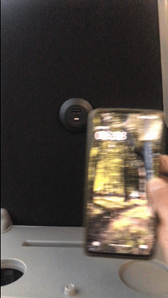
Whyyyyy
The charging experience:
Forgot your cable? No problem. Wireless? No problem. Enjoy your film!
Even if you book from your desktop, it comes down to your phone. The design audit and ideation helped identify a few key challenges:
The visual break in brand experience between the interface and the coach service.
Nested navigation: Coach hire and my past journeys can be surfaced.
Live map: It’s informative and useful, but doesn’t feel contextual to my journeys (being booked, ongoing, past journeys).
Simple and Transparent
Keeping with Ember’s core values, I explored a symmetry between the two key user flows (booking Ember, coach hire), as well as viewing past journeys: ‘Where, When, Who’.
Keeping this framework identical to both user flows would borrow from user familiarity -> ease of use -> product stickiness -> potentially higher conversion.
Memorable
There’s an opportunity to make certain passive aspects of the website more active - such as ‘Tickets’ -> ‘Journeys’. This introduces a layer of personalisation and emotion.
Aligning the experience of ‘Past journeys’ with the ‘Where, When, Who’ framework also allows it be elevated out - to be at the same architectural level as the two key user flows (booking and hiring). The hypothesis being that this could drive engagement -> stickiness -> higher conversions.
Traceable
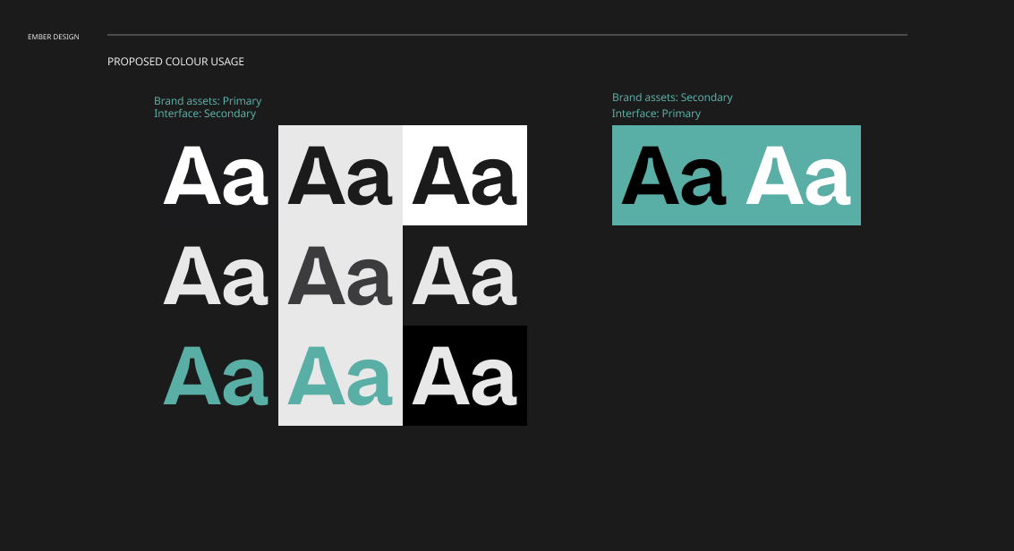
While I propose a moderate departure from the current brand identity, I also aim to moderately change the nature of how the brand tokens are used. The key difference is in utilising the brand hero colour for traceability of actions and information, instead of a default value choice for all sequential actions. Neutrals can carry a lot of the weight the brand hero colour currently carries. This would provide primacy and purpose to the brand hero colour, and should help with making the brand identity more iconic.
Visual continuity
A strong visual continuity is fundamental to the entire design effort. The visual differentiation of the brand shouldn’t start and end with the coach. It should in fact, be centred in the brand which then percolates through the entire service (physical and digital), even as it evolves.
The wild card 🃟
Ember has a highly engaging ‘Live map’. But it’s entirely dissociated from any of the key flows. There’s an opportunity to leverage the map and make it central to the booking experience - by making it contextual to user actions. The map can provide visual confirmation for user actions, help alleviate any errors, and make the process more engaging and memorable. Imagine being able to access your past journeys on a map. That’s so much more personal than knowing how much you paid!
Day 2 was (mostly) about craft and prototyping. I focused on stress-testing the brand tokens and auto-generated derivatives, against UI components critical for the identified user flows. Given the symmetry established between the three user flows (Booking, Hiring, Past journeys), I focused on one - booking.
Here’s what the brand presence looked and felt like with the unified visual language:
Thank you for the opportunity. 🙏🏻